Adjustable cue column
From a narrow 35 mm keyword strip to a generous 90 mm question column. The note area and its ruled lines rebuild around whatever you choose.
Cornell Notes Template Generator
The Cornell note-taking method only works if the three zones fit how you actually write. Set the cue column width, the summary band height and the line spacing, add a title and date row, then download a Cornell notes template that prints at true size on A4 or Letter.
Free, no sign-up, no watermark — vector PDF and PNG generated in your browser.
The preview is drawn to scale from the same geometry that goes into the PDF, so the column widths you see are the ones you measure on paper.
Every sheet is drawn as vector geometry inside your browser. Nothing is uploaded and nothing is stored. How to print at actual size (100%)
The classic layout was drawn for US Letter in the 1950s. A4 is narrower and taller, so copying those proportions blindly leaves you with a cramped note area and a summary band you never fill.
The original Cornell notes template uses a 2.5 inch cue column and a 2 inch summary band, and those are the defaults here. But if you write short keywords rather than full questions, a narrower cue column buys you real estate where you need it. Both dimensions are sliders measured in millimetres, and the note area recalculates its ruled lines instantly so nothing ends up half-drawn at the fold.
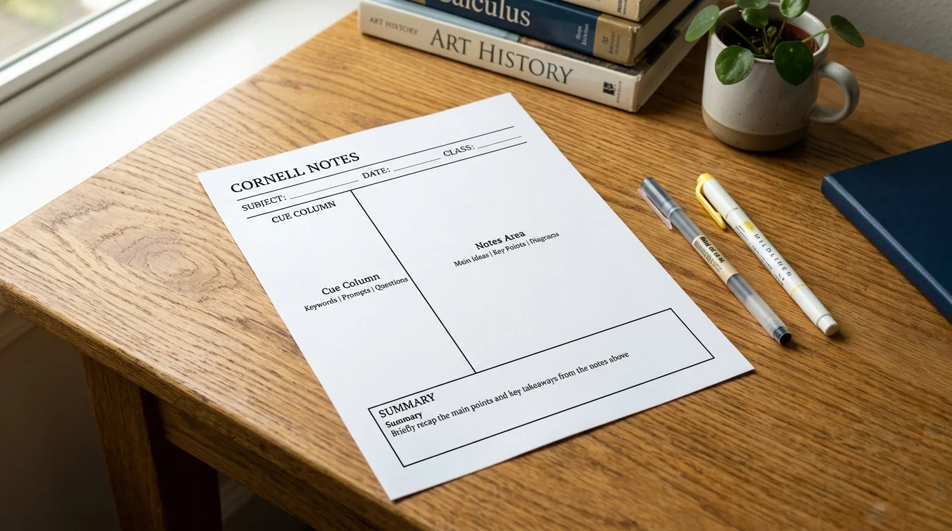
Each zone is labelled so students who are new to the Cornell method know what belongs where, and a name-and-date row at the top keeps a term's worth of lectures sortable. Line spacing follows the same college, wide and narrow standards as ordinary ruled paper, so a Cornell page sits happily in the same binder as the rest of your notes.
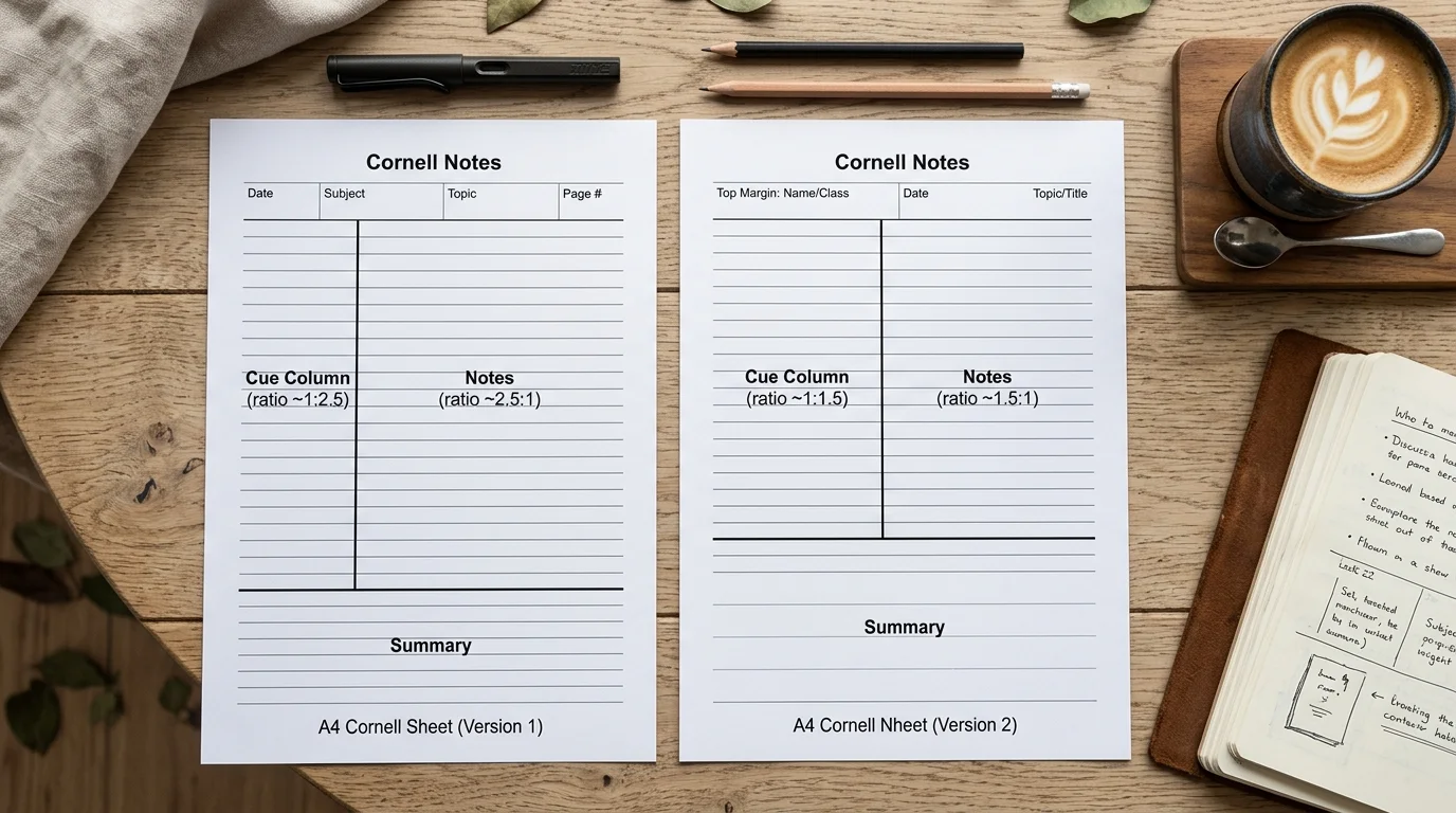
Everything a lecture hall, a revision session or a meeting room asks of a note page.
From a narrow 35 mm keyword strip to a generous 90 mm question column. The note area and its ruled lines rebuild around whatever you choose.
Two inches is the tradition, but a three-line summary needs less. Shrink it and the note area grows; the divider line moves with it so the page never looks improvised.
The same 7.1 mm, 8.7 mm and 6.35 mm standards used by ruled pads, plus any custom spacing, so your Cornell notes template matches the rest of your file.
Type the subject into the header and add a name-and-date rule. A term of lectures stays sortable instead of becoming an anonymous stack of paper.
Seven presets plus a colour picker, with separate widths for the zone dividers and the ruled lines. Pale grey keeps your handwriting the loudest thing on the page.
Print-exact PDF, PNG for tablet note apps, and up to twenty identical pages in one download when a whole module needs covering.
Four steps to a note page, and the method that makes it worth using.
Keep the classic 63.5 mm if you write full recall questions down the side. Narrow it to 40–50 mm if you only jot keywords, and the note area gains that width.
Allow enough height for three or four sentences — around 40 to 50 mm at college ruling. Then pick the line spacing that matches your handwriting and the rest of your notes.
Lines inside the note area rebuild automatically whenever you resize a zone.
Type the subject as the header title, switch on the name-and-date rule, then raise the page count so one download covers a whole week of lectures.
Print at A4 for European folders and Letter for North American binders — the layout is recalculated, not cropped.
Take notes in the right-hand area during the lecture. Afterwards, write recall questions in the cue column, then cover the notes and answer them. Finally, write the summary at the bottom in your own words.
Read the printing guideLayout dimensions, the method itself, paper sizes and printing.
Yes, completely. No account, no email wall, no watermark and no limit on how many pages you generate or print.
The traditional layout, designed at Cornell University for US Letter paper, uses a cue column about 2.5 inches (63.5 mm) wide on the left and a summary band about 2 inches (50.8 mm) tall at the bottom, leaving roughly a six-inch note area on the right. Both are the defaults here and both are adjustable.
Take notes in the large right-hand area during the lecture. Within a day, write recall questions or keywords in the left cue column. Then cover the note area, answer your own questions from memory, and write a short summary at the bottom in your own words. The layout exists to make that review loop unavoidable.
Yes. A4, US Letter, A5 and US Legal are all available. The zones are recalculated for each size rather than cropped, so an A4 sheet keeps sensible proportions instead of inheriting Letter's wider page.
Left is the standard, because most people write left to right and want the questions in the margin they see first when reviewing. This generator places it on the left, matching the original method and virtually every printed Cornell pad.
Yes. Choose college at 7.1 mm, wide at 8.7 mm, narrow at 6.35 mm, or set any custom spacing. The lines are redrawn to fill the note area evenly whenever you change a zone size.
The labels come from the page language and appear at the top of each zone in a light grey. If you want a completely bare layout, choose a very pale line colour — the labels follow the same colour, so they fade with the rest of the sheet.
Download the PDF, then in the print dialog set Scale to Actual size or 100% instead of Fit to page, and make sure the printer paper size matches the sheet you chose. Measure the cue column with a ruler to confirm.
Yes. Download the PNG and import it as a page template in GoodNotes, Notability, OneNote or Samsung Notes, or import the PDF directly if your app supports PDF templates.
Yes — print and photocopy them freely for your students and colleagues. Reselling the generated PDFs, or packaging them into commercial printable products, is not permitted.
Something not working as expected?
Size the three zones, pick your ruling, and print a set for the whole term.
No account, no watermark, and nothing you type leaves your browser.
Free • Vector PDF & PNG • A4, Letter, A5 & Legal